Bravo — Brand identity
- Brand identity
- Logo and emblem
- Brand book
- Applications
Engineering, digital and people: the emblem’s three layers, joined into a cube
- Five colours
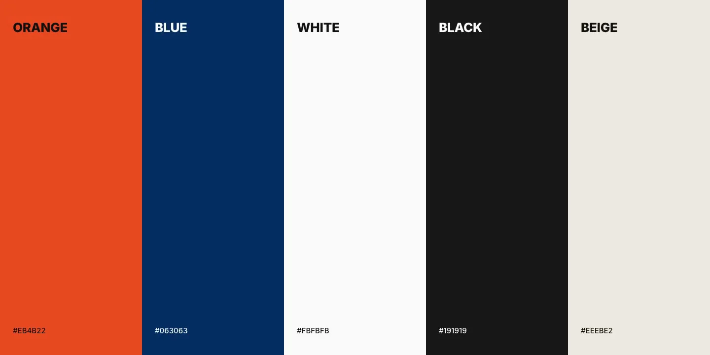
- Blue #063063, orange #EB4B22, black, white and a warm grey
- Two typefaces
- TT Firs Neue for the wordmark and headlines, Inter for text
What it changes
- Three directionsRead as three companiesNow: One emblem, three layers, one cube
- Where it livesA nameNow: Containers, vans, signage, print and app
- Using itAd hocNow: A brand book: versions, colour, type, applications
How we approach a brand: we start from what the company actually does, not from a mood board. We look for one idea that explains the business in a single shape, draw it until it holds at every size, and only then choose colour and type. Before anything is handed over, we put it on the real things it will live on — here, containers, vans, warehouse doors and a phone screen — because a logo that works on a slide and fails on a container is not finished.
- 01The brief
Bravo is three businesses under one name: engineering and industrial projects (shipbuilding, production, offshore), digital systems and IT, and the people and project management that staff and run them. Partners saw three companies. The task was one identity that a shipyard trusts on a container and a worker trusts on a job ad.
- 02One idea: three layers, one cube
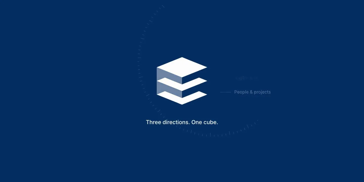
Instead of three logos, one sign. Each direction became a layer; the three are stacked, and a translucent wall on the left joins them into a single cube. The shape says what the company does — separate disciplines, working as one system — and it reads at sixteen pixels as well as on a ship’s side.
- 03The wordmark
BRAVO in TT Firs Neue, a strict geometric grotesque, set in capitals for a confident, engineered voice. One letter carries the character: the B, redrawn with a lengthened upper cut, so the name is recognisable even without the emblem.
- 04Colour with a job each
Deep blue #063063 as the main colour — reliability and the sea. Signal orange #EB4B22 for action only: accents, buttons, the things you should press. Black and white for text and grounds, and a warm grey for soft backgrounds. Five colours, each with one role, so the system stays strict when other people use it.
- 05Two typefaces
TT Firs Neue for the wordmark and headlines, where the brand speaks. Inter for everything that has to be read — documents, interfaces, job descriptions — because it is neutral and clear at small sizes.
- 06Tested at real scale
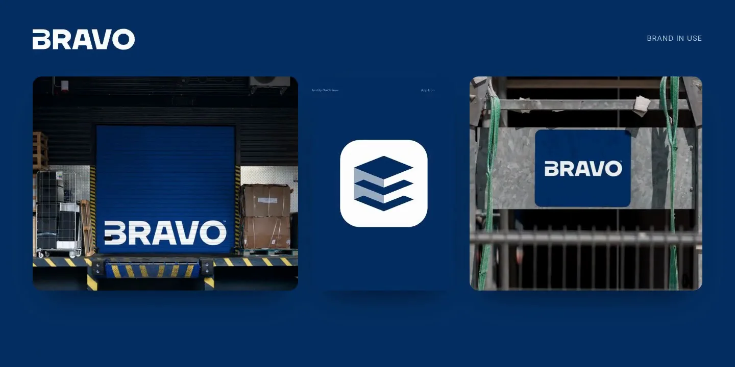
We put the identity on what Bravo actually uses: shipping containers, vans, warehouse doors, site signs, posters and an app icon. Each one checks something different — the emblem at twelve metres, the wordmark on a moving vehicle, the colours outdoors, the cube inside a rounded icon.
- 07Handover
A brand book anyone can work from: the logo in every version and on every ground, the colour palette with its roles, the type, and the applications. Then the website was built on it — the same blue, the same orange for actions, the same cube.
Same shape of problem on your side?
Fifteen minutes, no slides, and a reply within one working day.
Who picks up

“You will be talking to me, not to an account manager. I scope the work and I am on the build.”